BitDive Service Map Documentation
Overview
The Service Map is BitDive's central observability tool for understanding how your microservices communicate - in real time. It serves as the Real Runtime Data for your architecture, visualizing service-to-service communication, tracking requests between components, and providing the topological context required for deterministic verification.
This view is essential for developers, DevOps engineers, and SREs operating in distributed systems, where it's critical to correlate metrics, dependencies, and request flows in order to troubleshoot effectively.
Accessing the Service Map
To access the service map:
- Log in to your BitDive dashboard.
- Click Service Map in the left-hand menu.
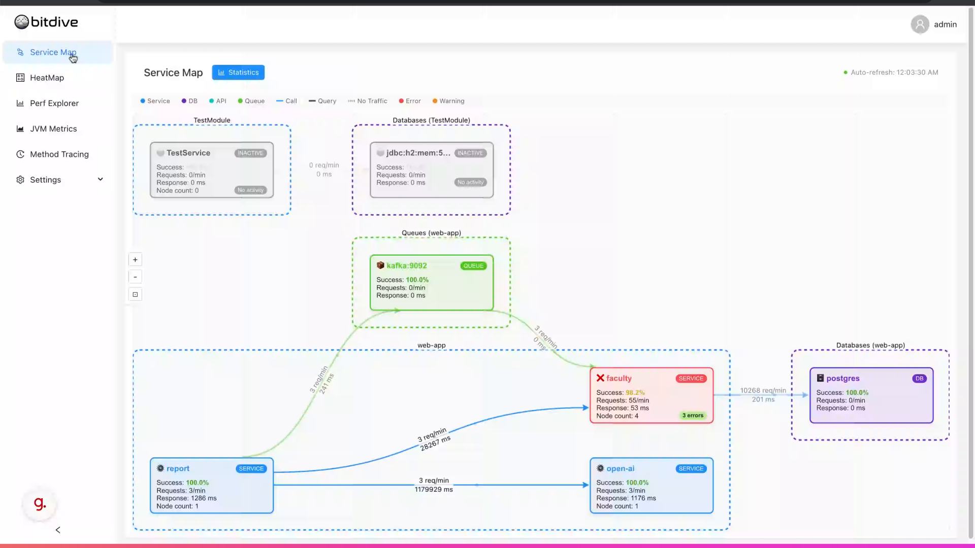
The system loads a graph view where each node represents a component (service, DB, message broker, API), and lines between them indicate active connections and request paths.
This real-time topology continuously updates, giving you instant visibility into the state of your architecture.
Understanding the Map Interface
Node Types
BitDive distinguishes between different component types using a color-coded legend:
- Service - application services and microservices
- DB - database connections
- API - external API endpoints
- Queue - message brokers and queues (e.g., Kafka)
Additional indicators include Error and Warning states to highlight problematic nodes.
Each node shows key performance metrics directly in the graph - making it easy to spot anomalies without opening a side panel.
On-Node Metrics
Each node displays:
- Success Rate - overall health indicator (% of successful requests)
- Request Rate - requests per minute
- Response Time - average latency (ms)
- Node Count - number of active instances
Example use cases:
- A high response time on a queue indicates delivery delay or consumer lag.
- A low success rate on a database node may point to auth or connection errors.
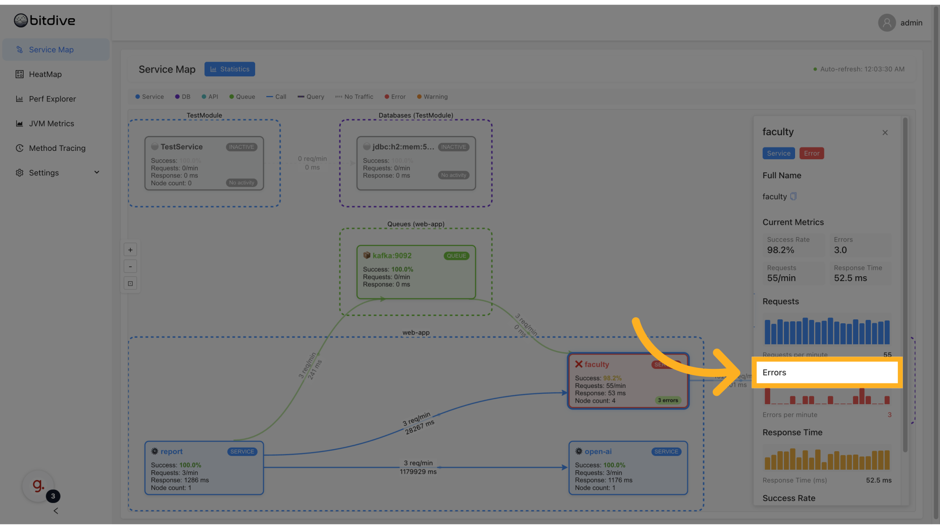
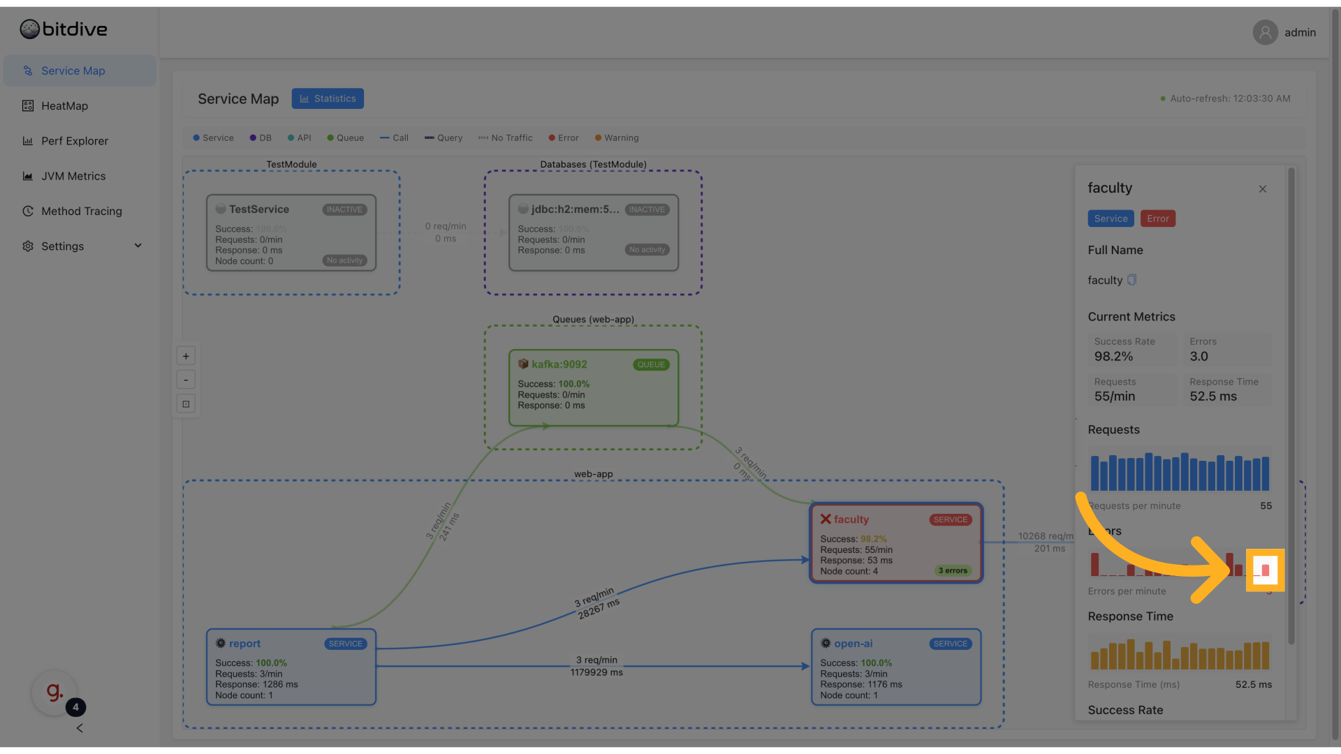
Service Details Panel
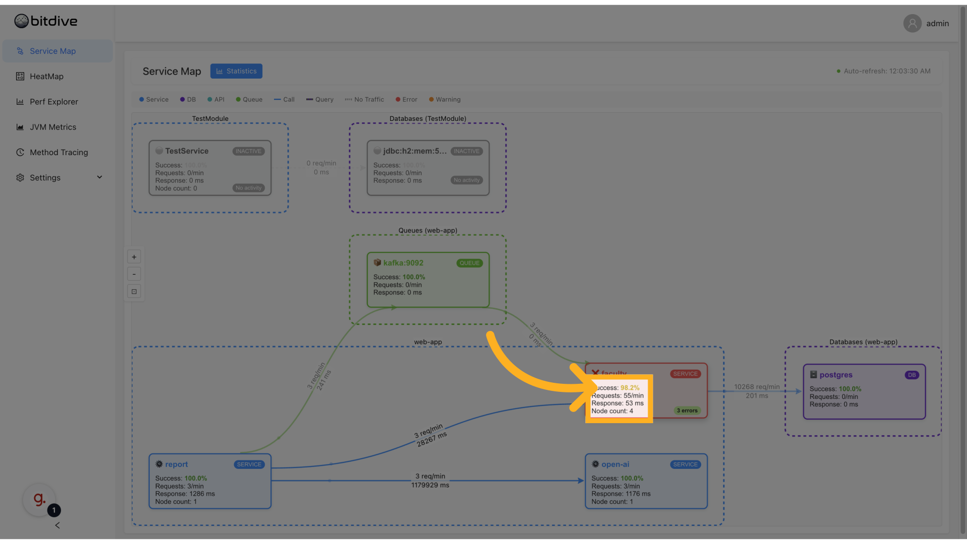
Clicking on a node opens the service detail panel on the right. This panel allows deeper inspection of metrics and events related to that service.
Metrics include:
- Success Rate
- Requests per minute
- Average / max / min response time
- Error count and rate
- Request throughput chart
- Node health (status, number of pods or instances)
This helps answer questions like:
- Is this service consistently slow, or just had a spike?
- Are errors correlated with traffic volume?
- How many nodes are involved, and is one of them unhealthy?
Viewing and Analyzing Errors
From the service panel, switch to the Errors tab to analyze failed requests.
This section includes:
- Recent error types (e.g.
HTTP 500,Timeout,Connection refused) - Frequency counts
- Related endpoints or consumers
- Timestamps of last occurrence
Use this to:
- Track down error spikes after deploys
- Identify recurring issues on specific endpoints
- Support exception tracking without separate tools
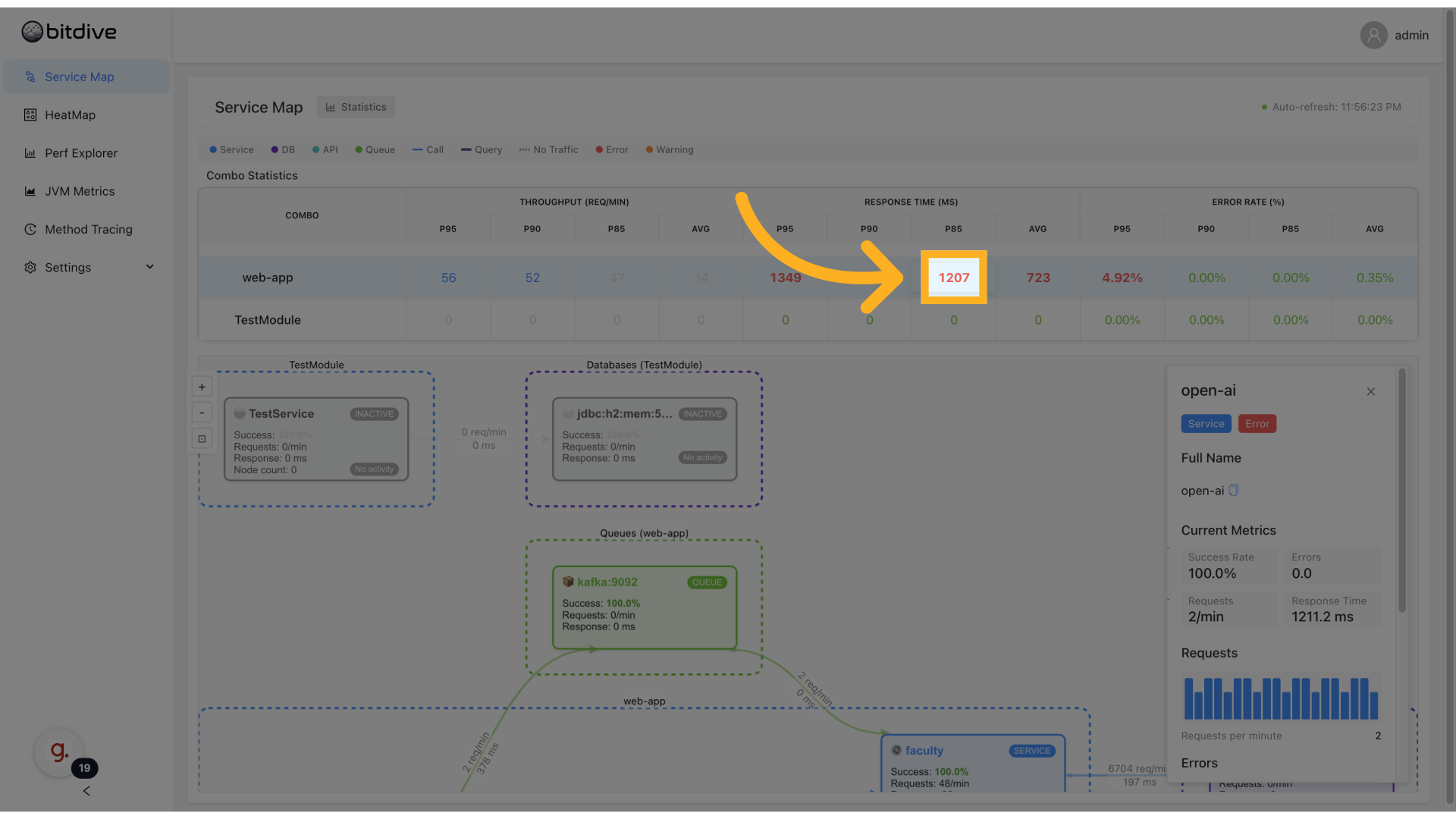
Exploring Statistics and Time Trends
Click the Statistics tab to explore time-series visualizations of the service's metrics.
This includes:
- Request volume over time
- Success rate fluctuations
- Latency percentiles (P50, P95, P99)
- Error trends (burst vs steady)
The statistical view helps answer questions like:
- Was this spike part of a general trend, or isolated?
- Are errors growing gradually or abruptly?
- Is P95 latency increasing while average stays stable?
Use these views to drive performance tuning or rollback decisions.
Key Use Cases
BitDive's Service Map is ideal for:
-
Distributed Tracing in Microservices Follow a request as it crosses multiple services, queues, and DBs - identifying where delays or failures happen.
-
Anomaly and Regression Detection Quickly detect services with degraded performance by looking at real-time latency or error trends.
-
Dependency Mapping and Impact Analysis Understand what services are impacted when one fails - and what happens when queues or DBs go down.
-
Continuous Monitoring for SREs Use the map as a live dashboard to track system health and spot potential incidents early.
-
Architecture Understanding for Developers & AI Agents Developers and AI agents (via MCP) can explore the system without needing tribal knowledge or outdated diagrams. The map provides the "reality baseline" for AI reasoning.
This tool forms the backbone of BitDive's APM observability stack and integrates deeply with other features like HeatMap and Performance Explorer.
Engineering Insight Distributed Tracing: Bridging Service Spans and Code Execution