BitDive HeatMap Dashboard
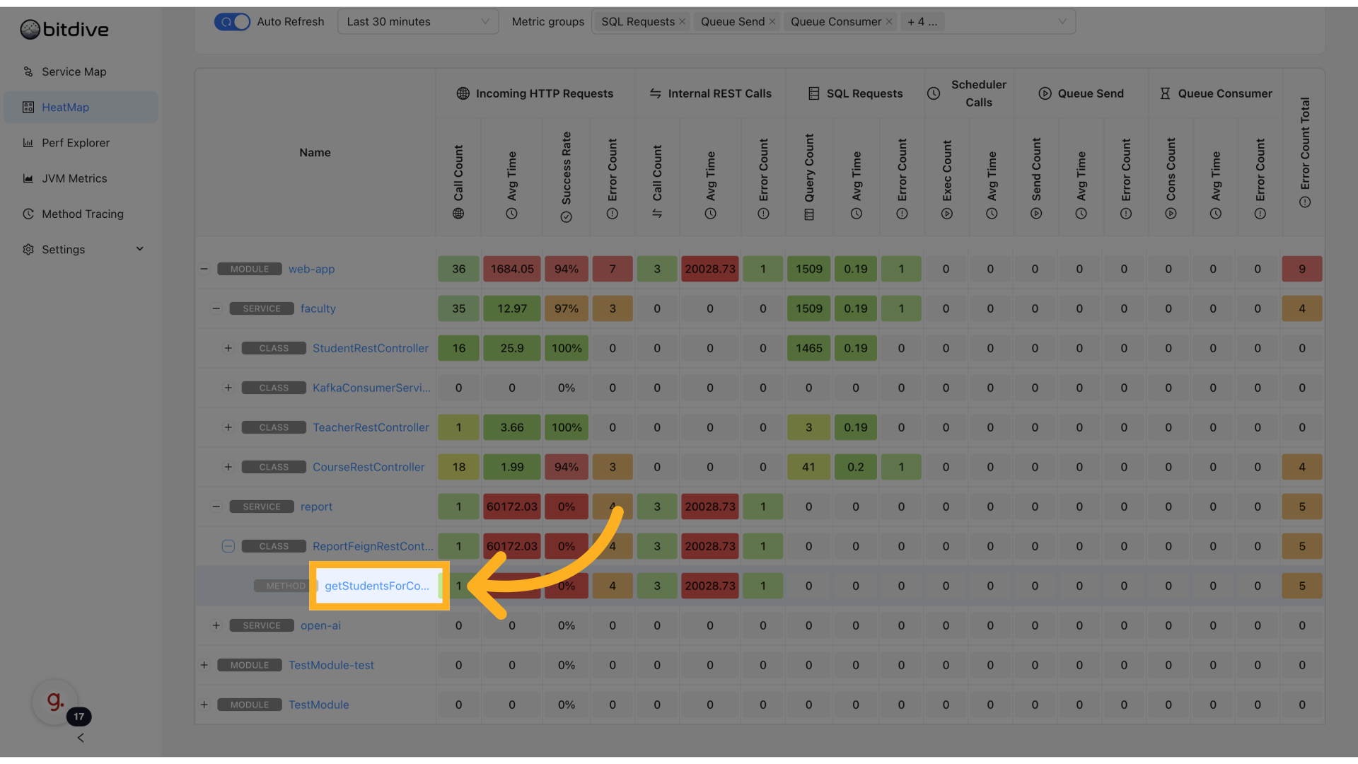
The BitDive HeatMap provides a real-time, method-level performance view across your entire distributed system. This visual profiler helps you visualize and analyze the performance characteristics of your system, displaying fine-grained metrics like latency, error rate, and throughput - grouped by application module, service, class, and method.
Color-coded intensity makes it easy to identify outliers: the slower or more error-prone a method is, the hotter (redder) its cell appears.
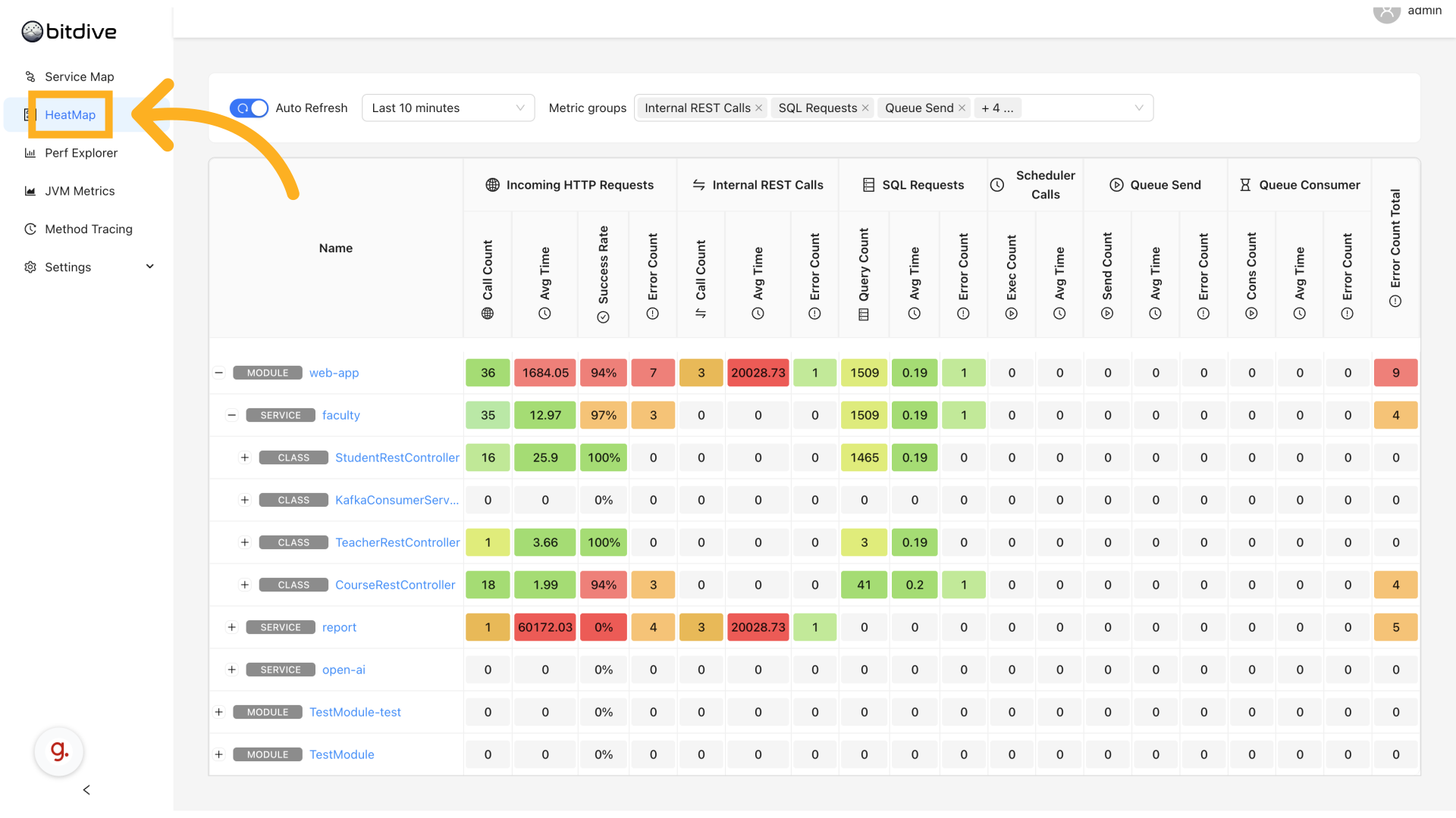
Accessing the HeatMap
- Open the BitDive dashboard.
- Select HeatMap in the left navigation.
This launches an expandable grid-based view of all services, down to the method level.
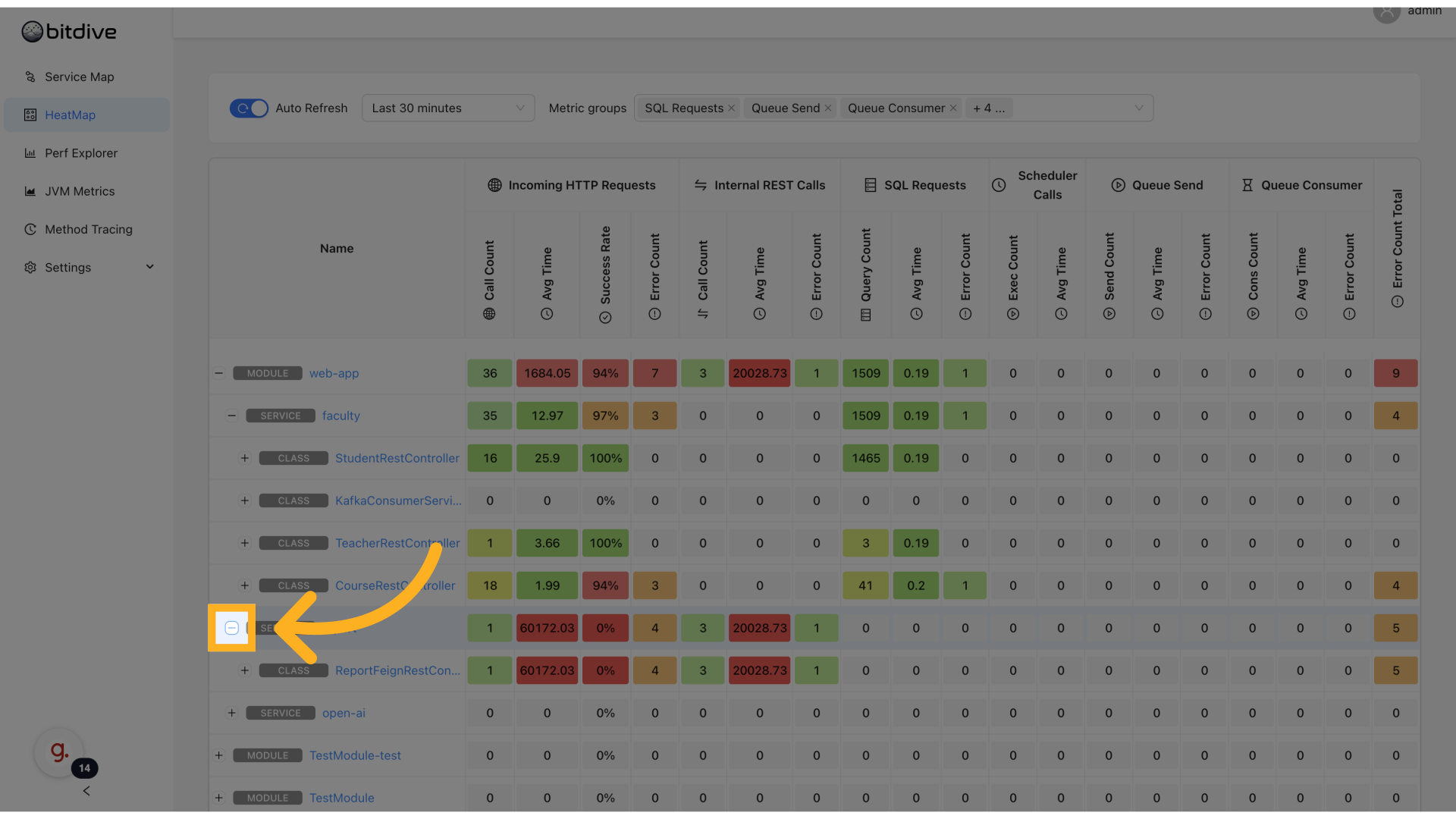
Navigating the Hierarchy
The HeatMap displays performance metrics in a hierarchical structure:
APPLICATION MODULE
└── MICROSERVICE
    └── CLASS
        └── METHOD
Each level shows detailed metrics including call counts, response times, success rates, and more.
Click on any row toggle to drill down or collapse the tree. This hierarchy enables quick narrowing from a system-wide view to one problematic method.
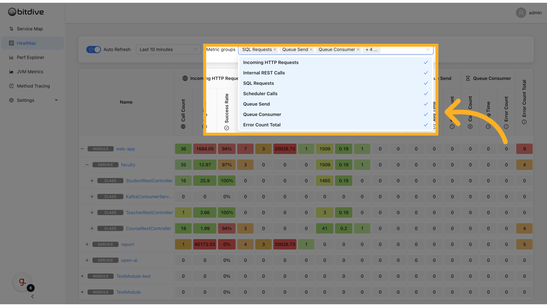
Metric Categories
The dashboard tracks several main types of metrics:
- Incoming HTTP Requests: External API calls to your application
- Internal REST Calls: Service-to-service communication
- SQL Queries: Database operations
- Scheduler Calls: Background task execution
- Queue Send Operations: Message enqueuing
- Queue Consumer Processing: Message handling
- Error Count (Total): Aggregated errors across all operations
Metric Columns
For each component, the dashboard displays:
| Column | Description |
|---|---|
| Call Count | Number of invocations |
| Avg Time | Average response time |
| Success Rate | Percentage of successful calls |
| Error Count | Number of failures |
| Query Count | Number of SQL queries (for database operations) |
| Exec Count | Number of executions |
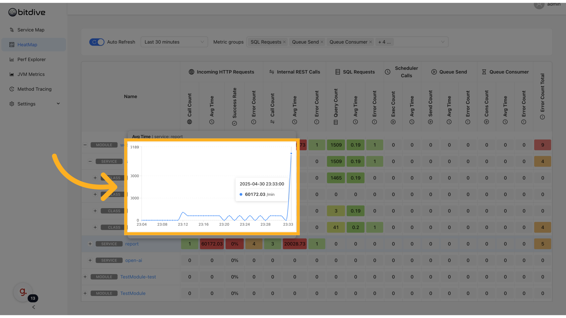
Reading the HeatMap
Each cell represents a method + metric combination. The dashboard uses color coding to highlight performance characteristics:
- 🔴 Red: Indicates high response times or potential issues
- 🟠 Orange: Elevated, but not critical
- 🟢 Green: Indicates healthy performance
Hovering over a cell shows:
- Time series chart for the metric
- Exact metric values
- Timestamps
This gives immediate insight into latency spikes, traffic bursts, or slow methods.
Performance Optimization Insight Identifying Bottlenecks: How to Use Flame Graphs to Optimize Performance
Method-Level Exploration
Click on any method to open the Performance Explorer:
- View long-term trends for that method
- Analyze call frequency and error patterns
- Access traces or flamegraphs (if enabled)
This is especially useful for isolating regressions introduced by recent deployments or changes.
Time Range & Refresh Settings
You can adjust the visible data window via:
- Time Range Selector - choose from predefined options like "Last 5m", "Last 30m", or custom durations
- Auto Refresh Toggle - updates the grid continuously
This allows for both incident triage and retrospective analysis.

When to Use HeatMap
- Troubleshoot slow endpoints
- Compare method performance across environments
- Identify outliers at the code level
- Continuously profile production workloads
- Monitor error clusters by method
Together with Service Map, HeatMap gives teams full-stack visibility from architecture-level to method-level - essential for production-grade application performance monitoring.